Experiments
Design simple ‘fair test’ experiments using the Scientific Method
Distinguish between observation, hypothesis and inference
Reference: SW9 page 17-23
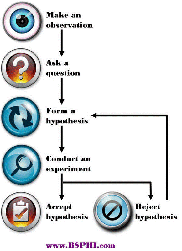
The steps in the Scientific Method are:
Design simple ‘fair test’ experiments using the Scientific Method
Distinguish between observation, hypothesis and inference
Reference: SW9 page 17-23
The steps in the Scientific Method are:
Use this site for help
http://www.sciencebuddies.org/science-fair-projects/project_scientific_method.shtml#overviewofthescientificmethod
Define the following terms:
Observation: X
Hypothesis: X
Watch this video of Edward Jenner, the English doctor who discovered vaccination.
http://www.youtube.com/watch?v=jJwGNPRmyTI
Describe how Jenner showed he was using the scientific method through observing.
X
Define the term inference. X
What did Jenner infer about cowpox and smallpox? X
Become skilled at recording information in tables
Data tables should follow the same format:
Explain why the measurement needs to have at least THREE trials. X
Explain why an average for the measurement is used. X
Use this data to produce a table. It is data of how far it takes a toy car to stop after it rolls down a ramp of different heights.
Ramp height (cm) 10, Distance travelled (cm) 19, 17, 23
Ramp height (cm) 15, Distance travelled (cm) 33, 29, 30
Ramp height (cm) 20, Distance travelled (cm) 41, 43, 41
Ramp height (cm) 25, Distance travelled (cm) 52, 56, 53
Ramp height (cm) 30, Distance travelled (cm) 61, 59, 65
Decide when to use bar graphs and when to use line graphs; and when to do a 'line of best fit'
Become skilled at drawing, labelling and interpreting graphs correctly
The type of graph you use depends on the type of data you have.
Discrete is either/or data e.g. type of animal, favourite colour, number of legs.
Continuous is a measurement e.g. height, weight, length, temperature, time.
Bar graphs are used when you have discrete data
Histograms are used when the data is continuous but each measurement falls into a range of measurements e.g. height between
150-155cm.
Line graphs are used when the data is continuous.
The line graph is the most commonly used type of graph.
To correctly draw a graph you must use TELLX. TELLX stands for -
T: X
E: X
L: X
L: X
X: X
Using the data table you produced before, draw graphs on graph paper. Make sure to use TELLX.
Complete SciPad page 20-21
Interpret results from experiments and apply to other situations
Using the data and graph you have previously completed, answer the following questions:
What is the general trend with the toy car stopping distance compared to the ramp height?
X
Based on this data, if you were to design a playground slide, how would you make sure the people using it wouldn’t go too far at the end?
X
Explain how you got this solution.
X
Write experimental reports
Follow instructions and perform simple experiments
Reference SW9 page 30-31
Complete the simple investigation on SciPad page 22.
Remember safety is important!
http://www.sciencebuddies.org/science-fair-projects/project_scientific_method.shtml#overviewofthescientificmethod
Define the following terms:
Observation: X
Hypothesis: X
Watch this video of Edward Jenner, the English doctor who discovered vaccination.
http://www.youtube.com/watch?v=jJwGNPRmyTI
Describe how Jenner showed he was using the scientific method through observing.
X
Define the term inference. X
What did Jenner infer about cowpox and smallpox? X
Become skilled at recording information in tables
Data tables should follow the same format:
- The variable you changed in the experiment is in the left column.
- The results for all of the different trials for the variable you measured are the middle columns.
- The average of all the trials in the right column.
Explain why the measurement needs to have at least THREE trials. X
Explain why an average for the measurement is used. X
Use this data to produce a table. It is data of how far it takes a toy car to stop after it rolls down a ramp of different heights.
Ramp height (cm) 10, Distance travelled (cm) 19, 17, 23
Ramp height (cm) 15, Distance travelled (cm) 33, 29, 30
Ramp height (cm) 20, Distance travelled (cm) 41, 43, 41
Ramp height (cm) 25, Distance travelled (cm) 52, 56, 53
Ramp height (cm) 30, Distance travelled (cm) 61, 59, 65
Decide when to use bar graphs and when to use line graphs; and when to do a 'line of best fit'
Become skilled at drawing, labelling and interpreting graphs correctly
The type of graph you use depends on the type of data you have.
Discrete is either/or data e.g. type of animal, favourite colour, number of legs.
Continuous is a measurement e.g. height, weight, length, temperature, time.
Bar graphs are used when you have discrete data
Histograms are used when the data is continuous but each measurement falls into a range of measurements e.g. height between
150-155cm.
Line graphs are used when the data is continuous.
The line graph is the most commonly used type of graph.
To correctly draw a graph you must use TELLX. TELLX stands for -
T: X
E: X
L: X
L: X
X: X
Using the data table you produced before, draw graphs on graph paper. Make sure to use TELLX.
Complete SciPad page 20-21
Interpret results from experiments and apply to other situations
Using the data and graph you have previously completed, answer the following questions:
What is the general trend with the toy car stopping distance compared to the ramp height?
X
Based on this data, if you were to design a playground slide, how would you make sure the people using it wouldn’t go too far at the end?
X
Explain how you got this solution.
X
Write experimental reports
Follow instructions and perform simple experiments
Reference SW9 page 30-31
Complete the simple investigation on SciPad page 22.
Remember safety is important!
